Increased energy prices are not the only reason why it is difficult find affordable commercial space these days. Symbiosol® is not only transforming the way we think about renewable energy,
but also creating eco-friendly and sustainable spaces for businesses and communities to thrive — for a brighter future.
Using the sun as a source of energy is not new; even the ancient Egyptians used mirrors to channel sunlight into the interior of their pyramids for brightness and warmth.
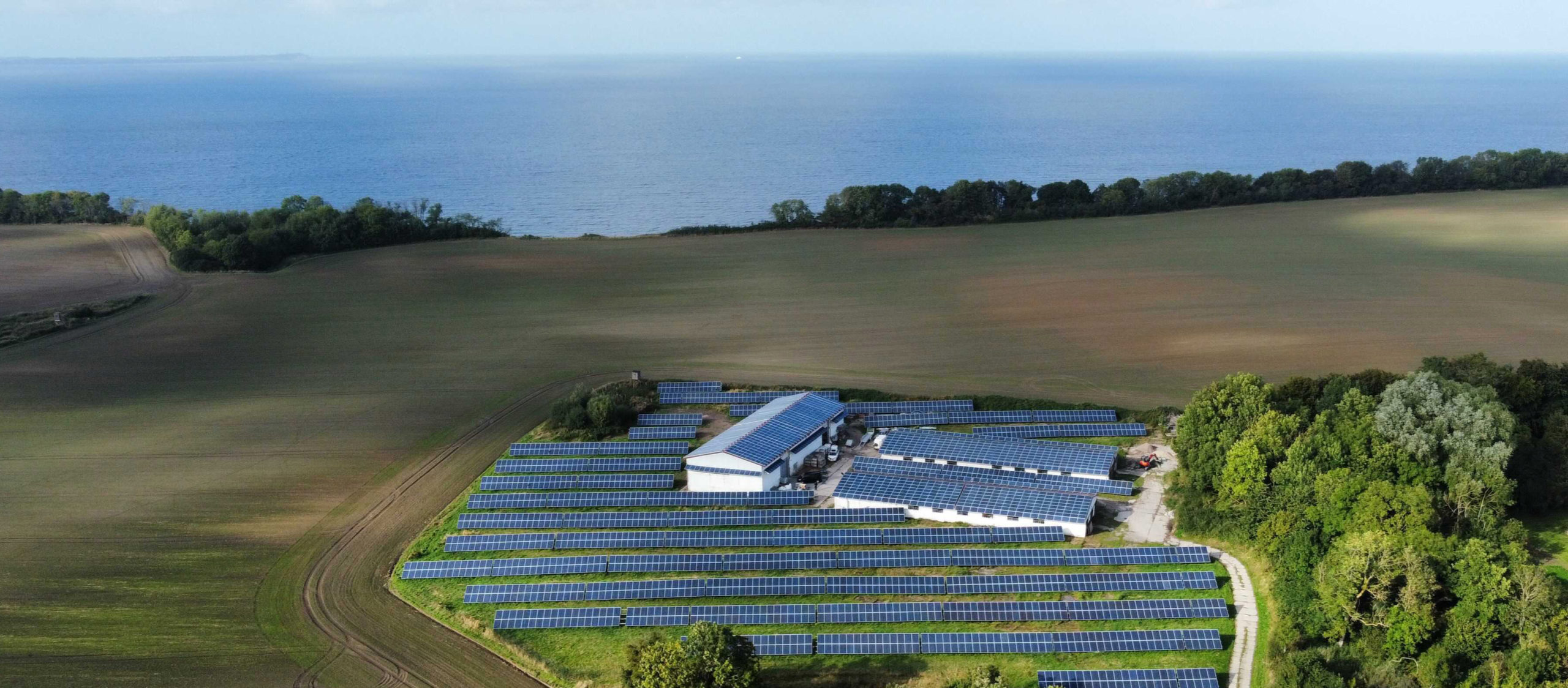
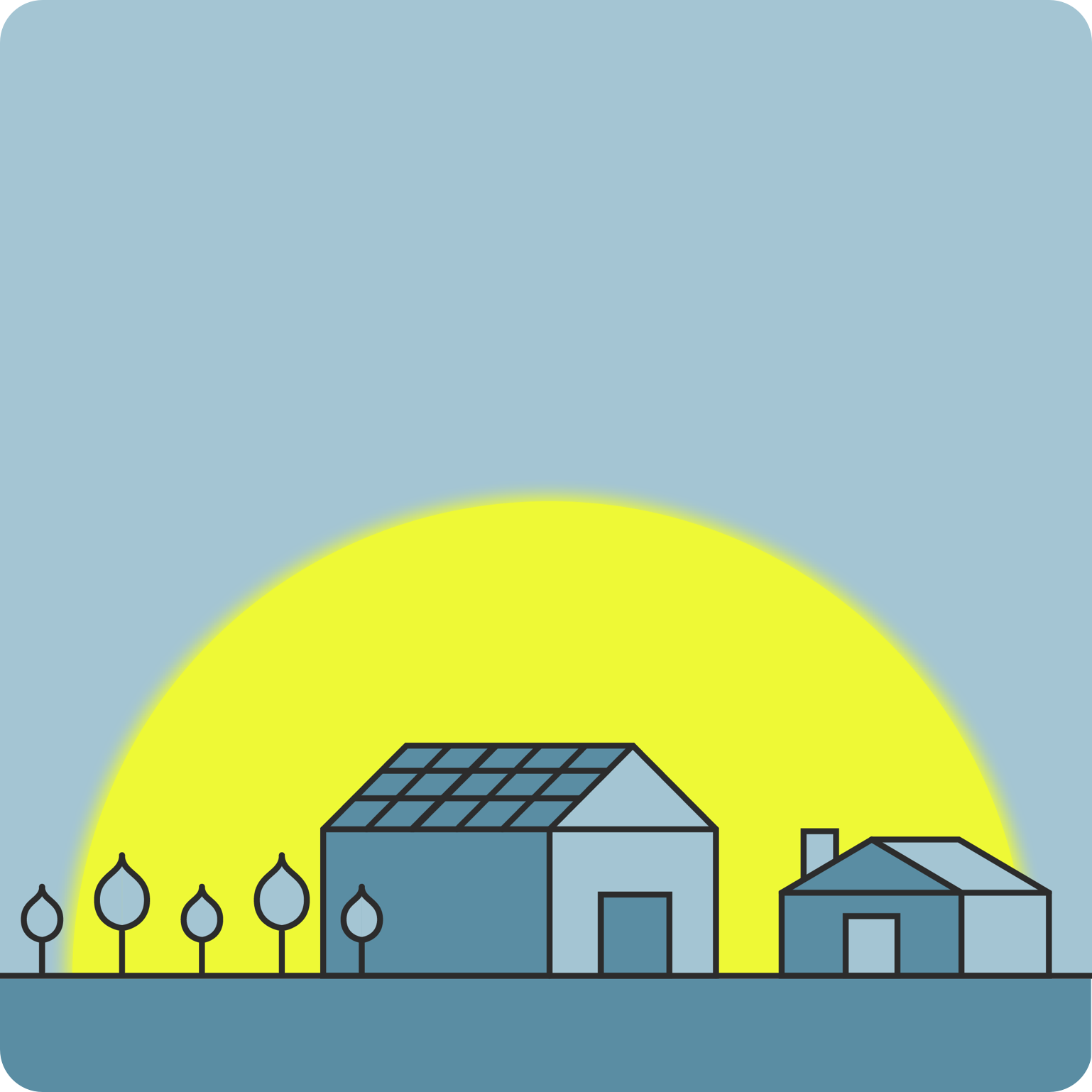
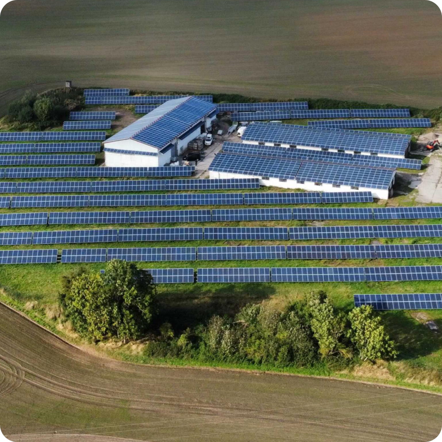
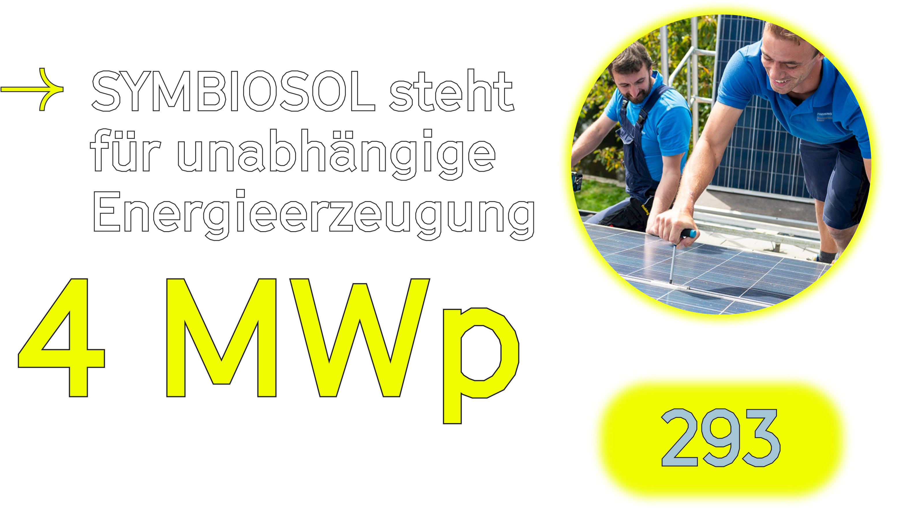
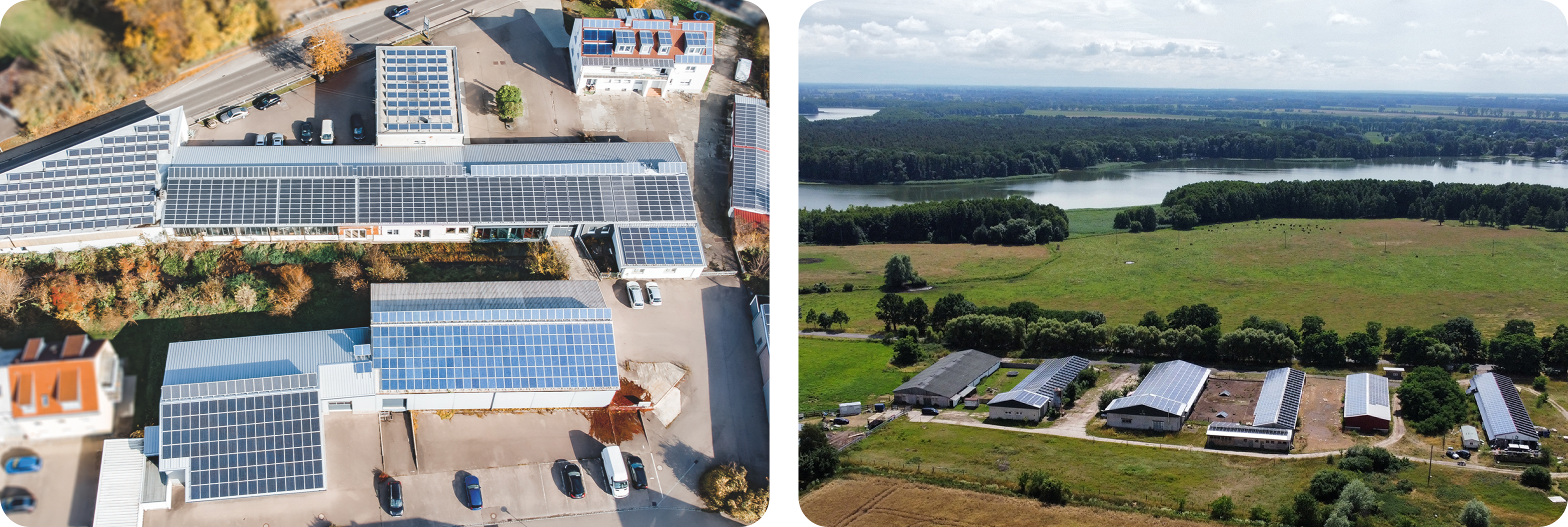
The use of solar energy via photovoltaic systems took off in Germany at the end of the 1990s. The company Symbiosol has developed the idea further and uses solar energy twice: With the specially developed “Duo-Solarparks”, electricity is generated and commercial space is created at the same time — 100% sustainable, of course.
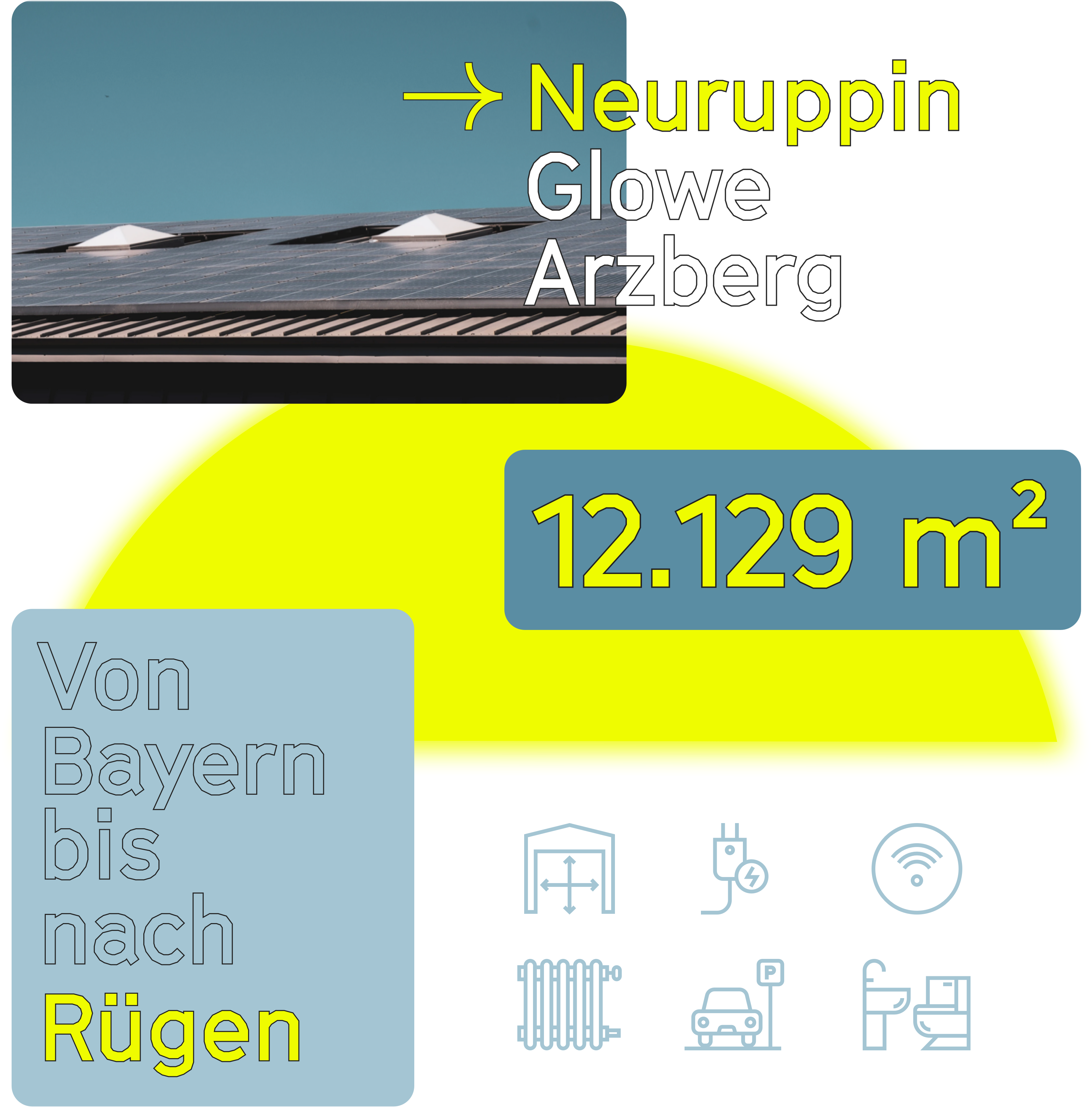
Since the first park was built in 2008, the company has now created 21 projects that give tradespeople a home with sustainable space.
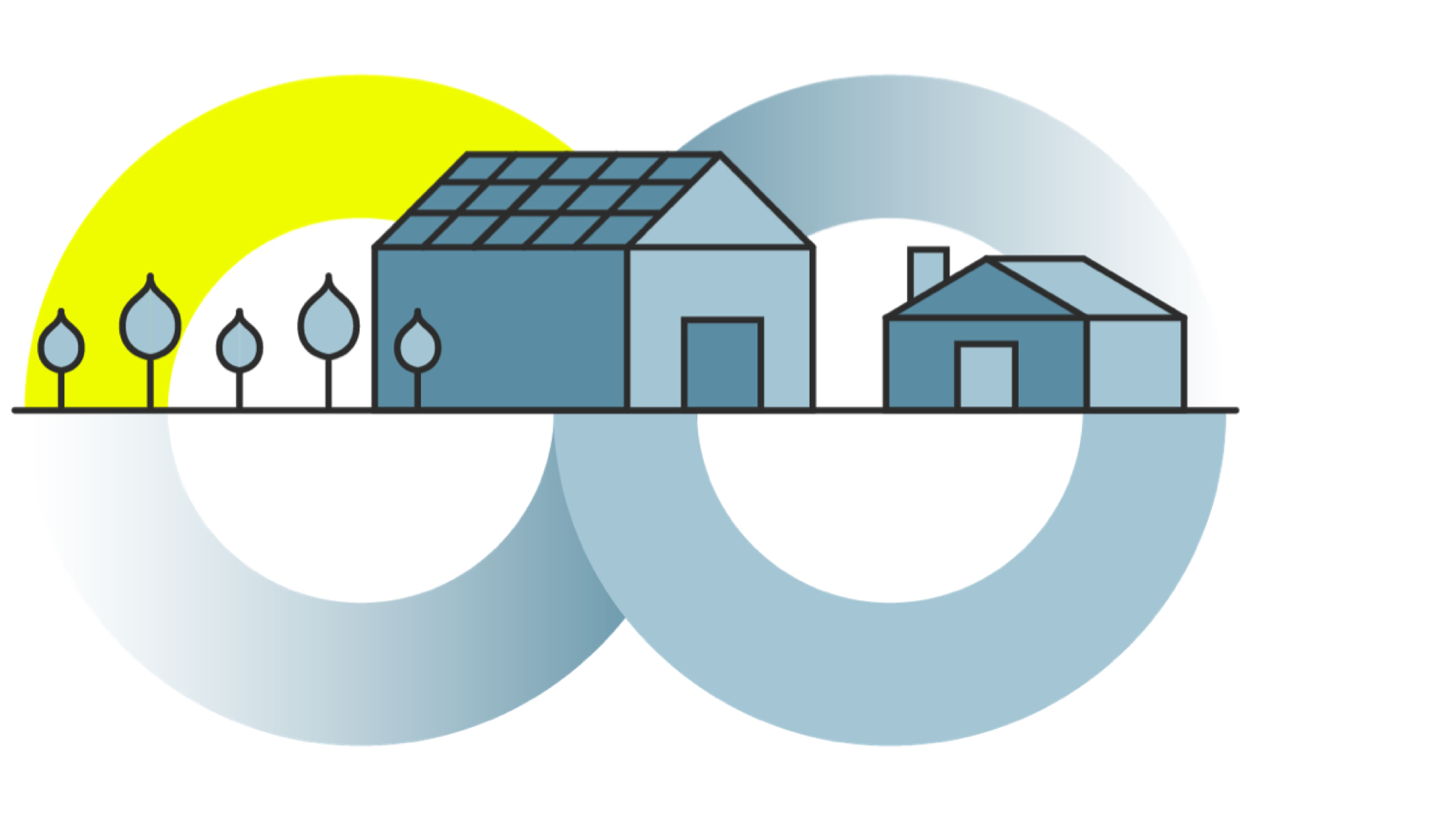
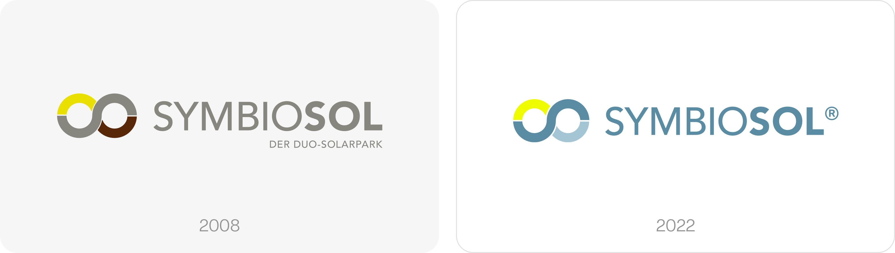
This emerging symbiosis and the associated continuous cycle were the starting point for the brand’s corporate identity, developed by Studio VEH in 2007: an infinity sign connects the two aspects and stands for continuous energy generation and supply, as well as friendly and respectful coexistence in the respective communities of the „Duo-Solarparks“.
Brand rebrush
14 years after the founding and expansion of the Duo-Solarpark on the island of Rügen, the company has decided to give its brand appearance an update – not least because the trademark has now been protected.
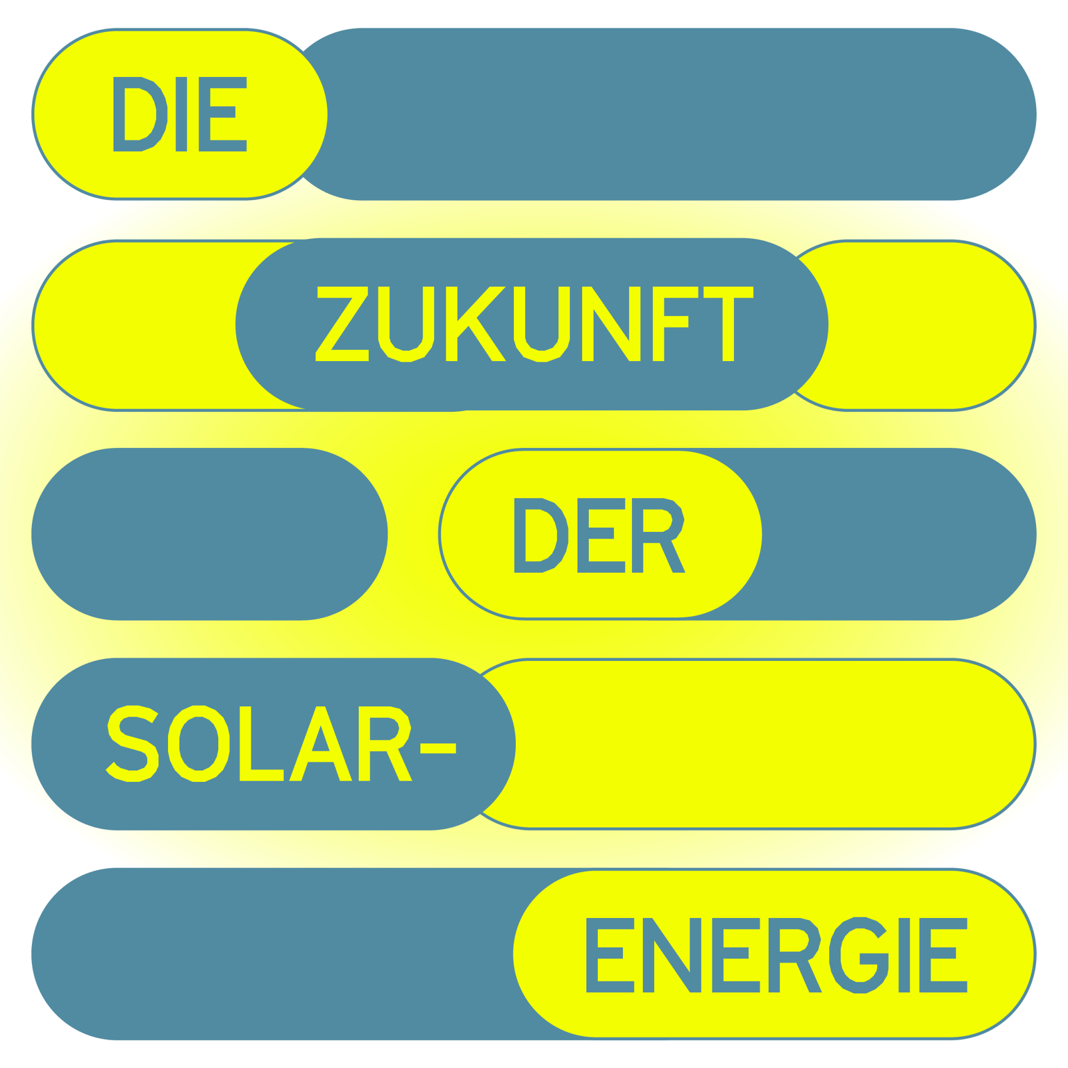
The tagline “Der Duo-Solarpark” is now used more freely and detached from the logo, especially in digital applications. The brand colors have been refreshed to underline the new projects in planning with even more radiance.
Sunshine meets high-tech
The increasingly rapid development of technology in the field of solar and photovoltaics is also reflected in the adapted visual identity of the brand: Blue in gradations stands for technology, reliability and stability. The newly used steel blue also conveys a sense of clarity and purity, representing clean energy generation through solar power.
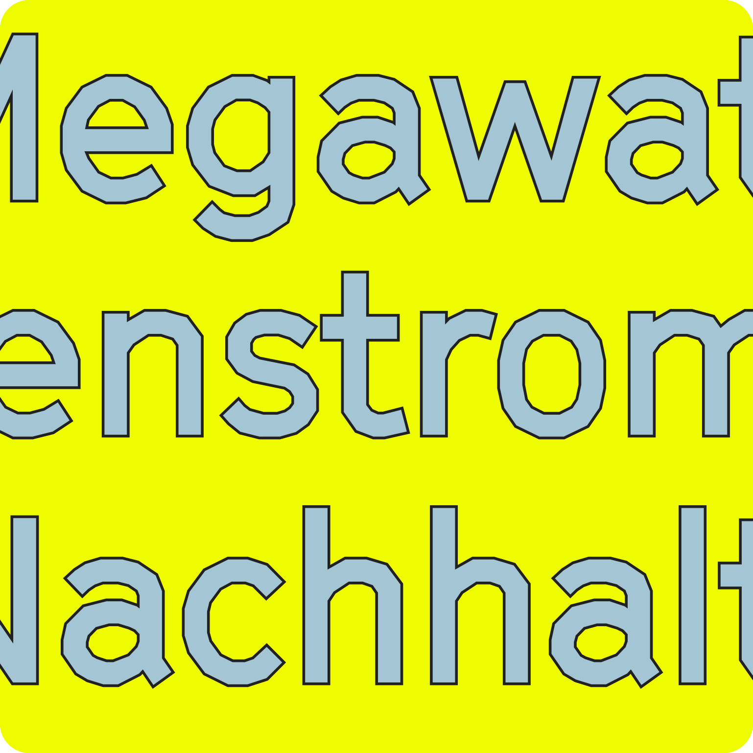
This is complemented by a new, distinctive house font: Grilli Type’s GT Cinetype perfectly underscores the brand’s technical approach.

The vibrant yellow is used in combination with the blue shades for all brand communication, creating a fresh, modern appearance: The combination evokes positive associations such as bright sunshine, blue skies and the sea — filling the premises of the Duo-Solarparks with a friendly and positive atmosphere. This positive mood runs through all communication applications.

The implementation of the print and digital communication is currently still in progress — attached are first examples, an addition of further communication examples will follow soon.
Team Credits
Strategy and Creative Direction: Franziska Veh
Art Direction: Lind Haugaard
Design: Callum O’Neill
Project Management: Kiyoshi Stelzner
Development: Ralf Büsch